We were commenting on the covers of Booster Gold #32 and the variant cover of Justice League: Generation Lost #1 both by the great Kevin Maguire. Todd more so than I, and myself are both huge fans of Maguire's art. Todd even has may sketches and commissions from Kevin, which you can see on Todd's Facebook.
Anywho, we were commenting about the coloring of these covers, using these fancy computers. Some people it works for, however, we both felt it took something away from Maguire's art.
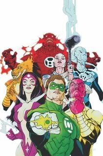
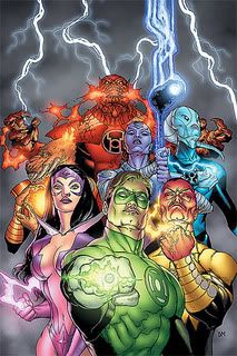
Here is an example that really bugged me from a few weeks ago, Green Lantern #53:

Look how cool this cover is! The first post Blackest Night issue of Green Lantern, showing all the main Lanterns for each color. The white background with the lush colors of each character really make the cover pop! However, when the issue hit stands, there were a few changes:

What happened? My main issue with the new cover is the change of the background from white to dark grey with the extra lightning. It's not a bad cover, but the changes to the way it's colored really irks me.
What do you think? Do you like the original version or the recolored one?
The original works much better, it's simple yet effective. Add the Green Lantern header to that and it's a powerful cover. The added background color and the lightening really don't add much of anything except to chew up some scenery. Plus, I'd kill tp have the original as a piece of art
ReplyDeleteI have shame. I like the recolored one. For my old eyes, it has more shading and texture. Plus lightning. A man can't go wrong with lightning.
ReplyDeleteThe white cover jumps out more to me, too; the New Guardians really seemed prominent and are lost in the grey background now.
ReplyDelete